I maintain an R package called juanr that I use for teaching. It’s a grab-bag of 30+ datasets that I’ve collected over the years from published research, government sources, and the great Data is Plural. I use them for in-class exercises, problem sets, and demos.
You can install it from GitHub:
remotes::install_github("hail2thief/juanr")
The full list of datasets is on the GitHub repo. Most of the datasets are ready to go: clean names, reasonable variable types. Some fun examples, below.
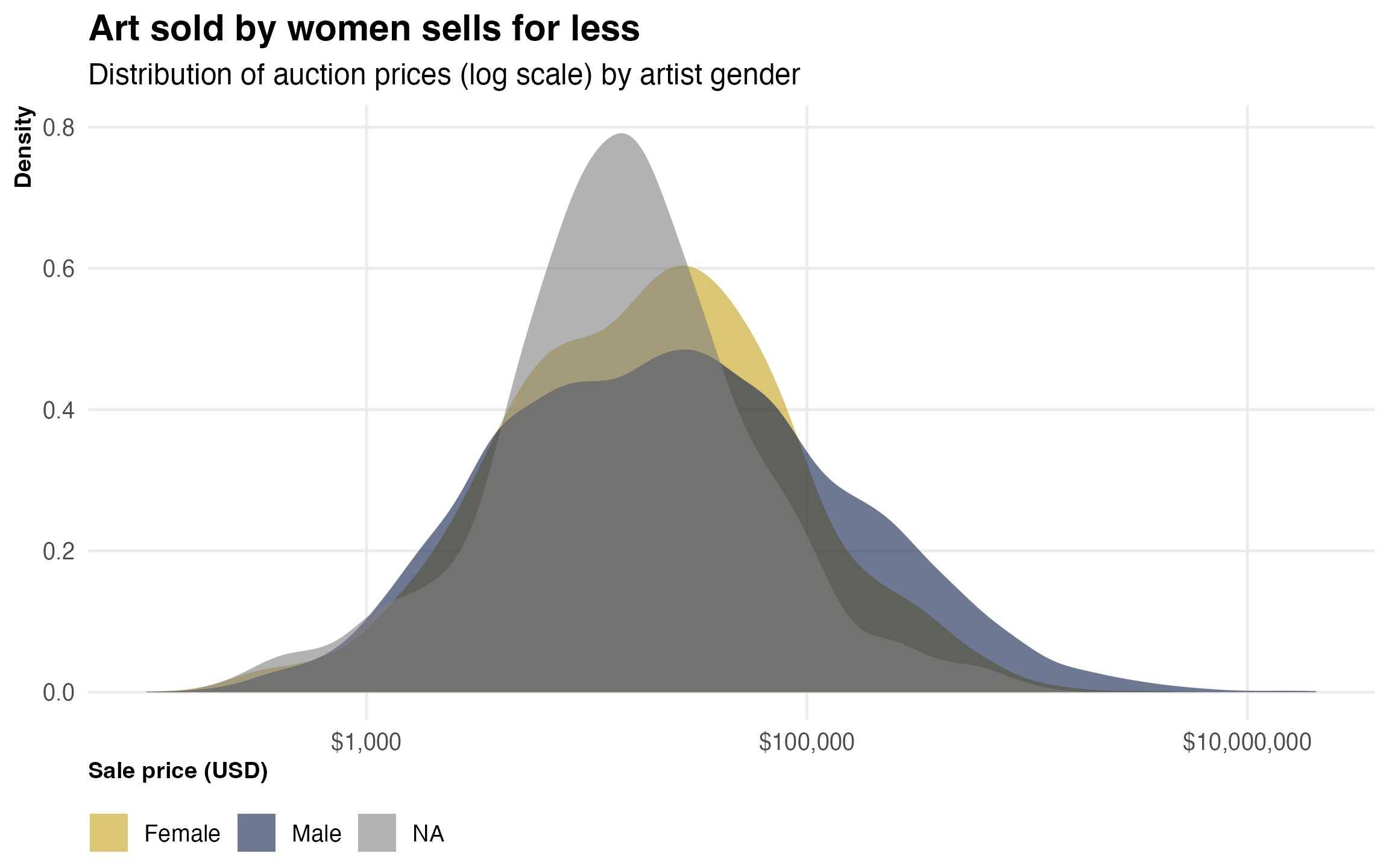
Art auction prices
The art dataset has about 18,000 records from art auctions around the world, from a 2024 study on what predicts art prices. It includes the sale price, the artist’s nationality and gender, and whether they went to an elite art school.
One question: how big is the gender gap in art prices?
art |>filter(real_price_usd >0) |>mutate(gender =if_else(gender_male ==1, "Male", "Female")) |>ggplot(aes(x = real_price_usd, fill = gender)) +geom_density(alpha =0.6, color =NA) +scale_x_log10(labels = scales::dollar_format()) +scale_fill_manual(values = pal[c(1, 7)]) +labs(title ="Art sold by women sells for less",subtitle ="Distribution of auction prices (log scale) by artist gender",x ="Sale price (USD)",y ="Density",fill =NULL )
Or: does going to an elite art school help? Here’s the median price by gender and elite school attendance:
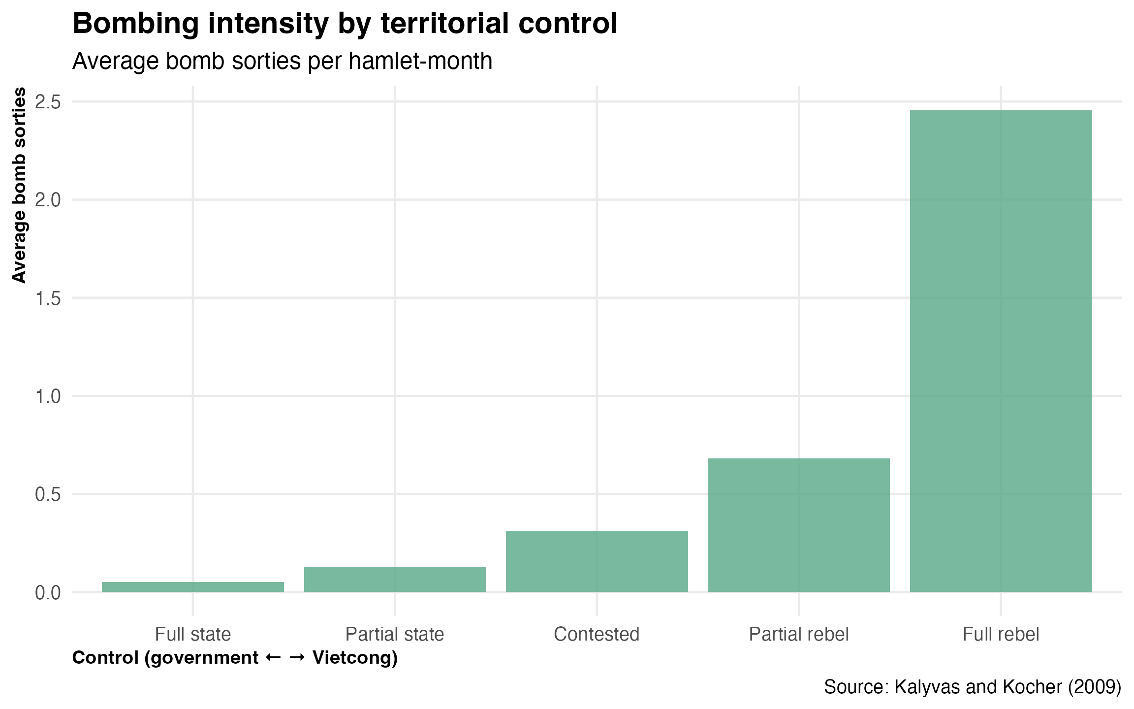
The vietnam dataset comes from Kalyvas and Kocher (2009) and contains over 70,000 hamlet-month observations from the Hamlet Evaluation System (HES) — the US military’s attempt to track “progress” during the Vietnam War. Each hamlet was assessed on who controlled it (the government, the Vietcong, or somewhere in between), along with information on bombing, population, and whether the Vietcong used selective terror against civilians.
Here’s the relationship between territorial control and bombing:
vietnam |>filter(!is.na(control), !is.na(bombs)) |>summarise(avg_bombs =mean(bombs),.by = control ) |>ggplot(aes(x =factor(control), y = avg_bombs)) +geom_col(fill = pal[3], alpha =0.8) +labs(title ="Bombing intensity by territorial control",subtitle ="Average bomb sorties per hamlet-month",x ="Control (government \u2190 \u2192 Vietcong)",y ="Average bomb sorties",caption ="Source: Kalyvas and Kocher (2009)" )
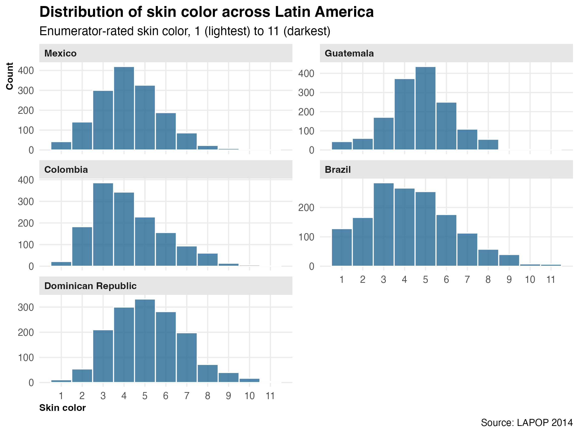
Colorism in Latin America
The race dataset comes from the 2014 wave of the Latin American Public Opinion Project (LAPOP). Enumerators rated each respondent’s skin color on a scale from 1 (lightest) to 11 (darkest) using a standardized color palette. The data covers Colombia, Brazil, Mexico, Guatemala, and the Dominican Republic.
Skin color is one of those things that everyone in Latin America knows matters but that can be hard to pin down empirically. This dataset lets you see the variation:
race |>filter(!is.na(colorr), !is.na(pais)) |>ggplot(aes(x = colorr)) +geom_histogram(binwidth =1, fill = pal[5], color ="white", alpha =0.8) +facet_wrap(~pais, scales ="free_y", ncol =2) +scale_x_continuous(breaks =1:11) +labs(title ="Distribution of skin color across Latin America",subtitle ="Enumerator-rated skin color, 1 (lightest) to 11 (darkest)",x ="Skin color",y ="Count",caption ="Source: LAPOP 2014" )
The distributions are pretty different across countries. Brazil and Colombia have wider spreads, while Mexico and Guatemala cluster more tightly. The Dominican Republic is interesting.